

There's a likely overworn saying that goes something like, "The only thing worse than no data is bad data." And it's admittedly hard not to feel like that has truth to it any time you come across data that you'd like to work with, but has a glaring flaw beyond the typical issues almost all data sets have.
This week my simple interest is to discover what pulling trends have looked like in the AUDL this season. However, in my early research, I was disappointed to find out who the player with the most pulls was this year:
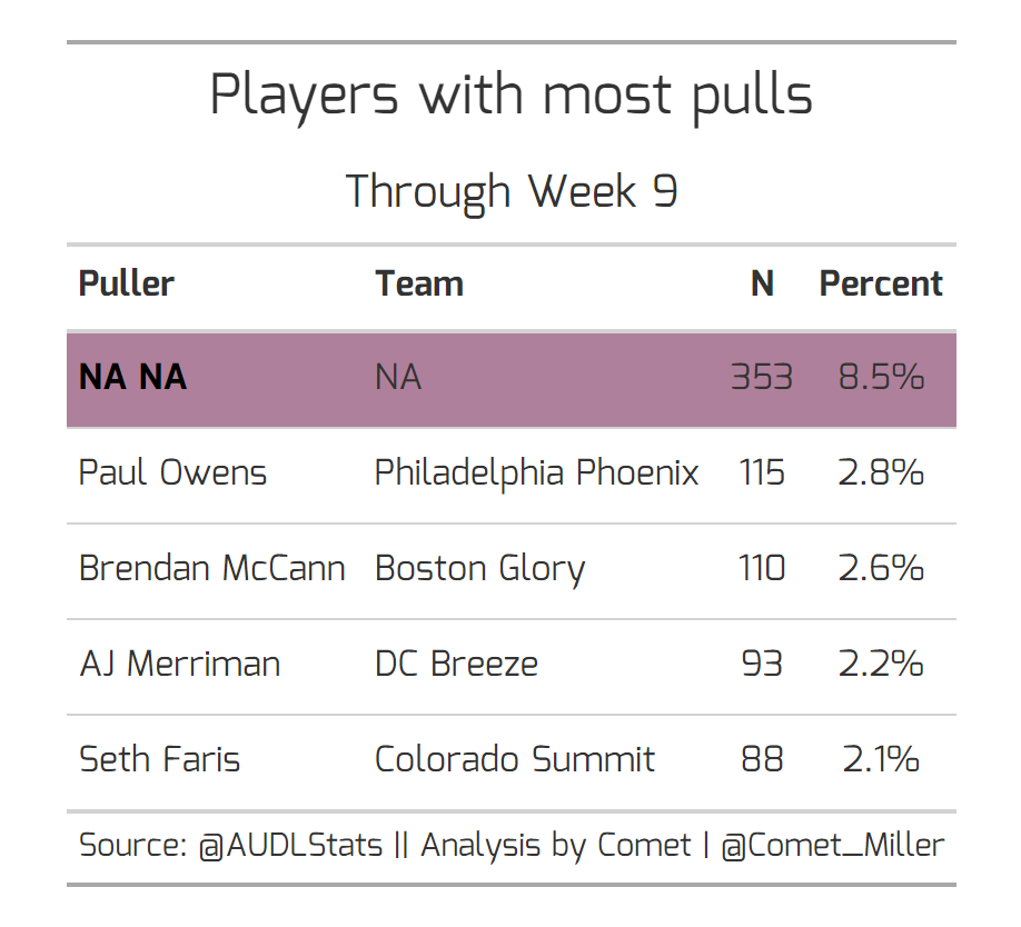
As you can already tell, "NA NA" is not a typo for one of the NBA's all time best named players. It's coded as "unknown" in the data and we actually don't know who has pulled on over 350 pulls this season. This amounts to almost a tenth of all pulls in the AUDL so far this season. There are a myriad of reasons why this is a bummer from a blog-posting and insight-searching point of view that I'm sitting here with. However, as someone who has worked in sports analytics in different leagues and sports, knowing you have accurate data (up to reasonable random error) is essential for the extracurriculars (read: sports betting, specialty insurance pricing, etc.) that are important to the success of a sport and a professional league.
I have an immense amount of respect for the strides the AUDL has made in the data gathering space (which also is so important to that league growth), and I by no means want to diminish that. But being able to be accurate in things we can control is quite important. So, in the off chance you're a stat keeper for an AUDL team and reading this...first off — thank you! I've seen the work it takes to get it right and it's not an easy job. Second, please record those additional things such as who the puller is as often and accurately as possible. And third, thank you again. Without you, we don't get any of the data that will be so important in engaging audiences and opportunities this sport wouldn't otherwise have.
Having said all that, the data we do have still has value because those unknown pullers still pulled and we know what the outcomes were on those pulls. So, let's take some cursory looks at the pulling trends so far this season.
Shot charts and moving the line
One of the most intriguing rule changes since last season was the movement in the pulling location. Ultimate has traditionally had the pulling team "kick-off" from their own goal line. This year, however, the pull can start from the pulling team's brick line, 20 yards farther up field than before. The "shot chart" below shows the difference between where pulls landed last year and this year. In all plots in this post, we are assuming that the offense is receiving from the north endzone and the pulling team is starting from the south brick mark.

It seems obvious that the intention behind the rule change is working as planned, with teams generally fielding pulls deeper than last year. In fact, on average, pulls are being fielded about 10 yards deeper (9.1 yards to be exact) this year. Figuring out defensive advantage created from the extra 10 yards an offense has to go in order to score is a project for another day, but I'd like to think that the change isn't unnoticeably marginal.
Pulling zones
Next, I identified some basic zones on the field that feel like they can be grouped together. They are by no means perfect, but these zones seem like a good starting point to categorize pulling locations. Below is a birds-eye view of a field with zones filled in.
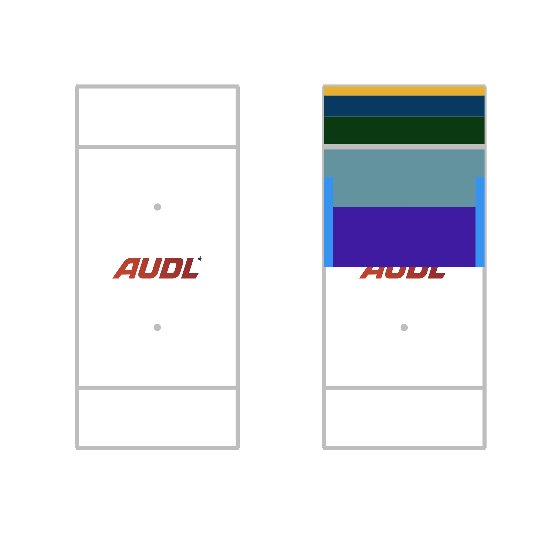
The plot on the left is a basic AUDL field and the plot on the right is the AUDL field with the zones overlayed. Let me quickly justify these zones from top to bottom (and if you have better ideas or adjustments to these zones, feel free to suggest them):
Back line — shown in the plot in yellow, these are pulls that end up within 3 yards of the back line of the endzone; this primarily contains pulls that are rolled out the back of the endzone that require the receiving team to play the disc in from the back line
Back endzone — shown in the plot in dark blue, these are pulls that land within 10 yards of the back of the endzone, but not including pulls that end up on the back line
Front endzone — shown in the plot in dark green, these are pulls that land in the endzone and within 10 yards of the goal line
Bad — shown in the plot in teal, I've resorted to giving this zone a straight-up adjective, since naming it was difficult and with the new pull location being 20 yards closer than in the past, a pull that lands in front of the endzone is, barring lots of wind, generally not good
Very bad — shown in the plot in purple, these are pulls that land in the field of play but only went 20 to 40 yards in distance
Roller — shown in the plot in light blue, these are pulls that were likely rolled out of bounds on purpose; many teams will set double teams or trap defenses off of a pull when intentionally pulling in this zone
Just for reference, below is the "shot chart" plot from before, but with the zones color coded.

The naked eye does a decent job pulling out the trends, but the numerical changes from last year to this year can be seen in the following table.

For comparison's sake, I randomly sampled the total amount of pulls thus far in 2023 from all of the pulls in 2022 in order to be able to make some comparisons from last year to this year (note: I could have also just taken the 2022 pulls up until week 10, but I'm assuming that pulling performance or decisions weren't systematically different during the last few weeks of the season). I sorted the table based on most frequent pulling "zone" to least frequent "zone" during 2022. The percentage change from 2022 to 2023 is quite astounding. There has been a 612% increase in pulls this year that have gone to the back line of the endzone! Further, the "Bad" and "Very bad" zones have seen large decreases. Notably, roller pulls have stayed almost exactly constant.
Because of how much more prevalent pulling into the back half of the endzone seems to be this year compared to last, I believe that the advantage the defense is gaining is more than just an additional 10 yards the offense has to march the disc — the defense also gets an advantage by allowing the offense less reset space (and almost no negative reset space) when fielding in the back of the endzone. And I would argue that that is worth more than simply the additional 20 yards into the field that the pulling team starts from.
Team trends
Let's break it down one step further. The following table shows the team-by-team pulling locations during the 2023 season so far. Each percentage is the fraction of that team's in-bounds pulls that were in the respective zone.
For all the categories except "Bad" and "Very bad", green means that the team is pulling to that location more frequently than the other teams, while red means that the team is pulling to that zone less frequently. For the "Bad" and "Very bad" zones, lower frequencies are green and higher frequencies are red. The table is sorted on the "Roller" zone with most frequent at the top.

I'm not going to pull out every intriguing number from this table, but it is interesting that the Wind Chill have far and away the highest percentage of pulls that go to the back line of the endzone. I would hypothesize that's because of how windy it tends to be at Sea Foam Stadium, making it easy to blade a pull out the back while going down wind.
While it would be fun to dig into the tendencies that individual pullers have, I don't quite feel comfortable doing that with almost 10% of the data missing, although I'd be curious to know if the unknown pullers are somehow systematically different than the rest of the data.
Chase for Championship Weekend update
It's no secret that the Wind Chill had a rough weekend out in Colorado, and apparently the model recognized that. For the first time this season, the AlleyCats are the favorite to come out of the Central. Additionally, Colorado jumped back in front of Oakland for the second most likely spot out of the West Division.

감사합니다
What do you think? Do you like the effect the new pulling rule is having on the game?
Thank you to @AUDLStats for the data. You can follow/contact me on Twitter @Comet_Miller.
— 밀혜성
I'm confused by the champ weekend percentages. For example, Thunderbirds and Union still both control their own destiny for a playoff spot whereas the Radicals are (nearly) eliminated from contention already at 1-7. How is Madison ahead of both in %?